Good Cheer’s New Look: Inside our Rebrand
Good Cheer was founded in 1962, and over the years, our look has evolved alongside our organization. From the early days of beautifully hand-painted signs to the more recent versions of our logo, each iteration has reflected a chapter of our story.


For the past two decades, our familiar grocery bag logo has served us well. It has become a recognizable symbol in our community, and we hold a lot of affection for it, but we knew it was ready for a refresh: something that could better reflect who we have been, who we are today, and where we’re headed.
Last year, we began a thoughtful rebrand process with the goal of bringing all the pieces of Good Cheer together into one cohesive visual identity. We wanted to honor our roots and founding, while also capturing our mission, vision, and values in a way that feels fresh, welcoming, and distinctly “Good Cheer.”
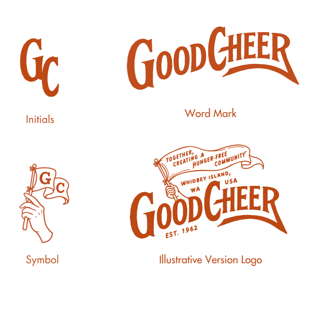
We’re thrilled to share that our designer, Nick Stroia of Buffalo Nickel Co., truly brought that vision to life. He created a logo system (drawing the lettering by hand, juts like our old signs!) that feels both timeless and new, something that reflects our organization and the spirit of the community we serve.
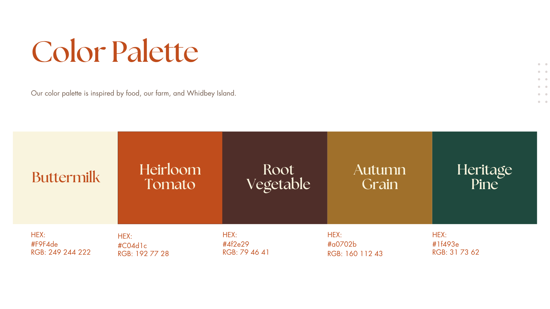
So without further ado, we’re excited to introduce our new look: